How to Use Shadcn/UI in React.js
Learn how to leverage Shadcn/UI in React.js to build customizable and lightweight interfaces. Discover how to integrate it with EchoAPI for efficient API management and testing.
How to Use Shadcn/UI in React.js
Learn how to leverage Shadcn/UI in React.js to build customizable and lightweight interfaces. Discover how to integrate it with EchoAPI for efficient API management and testing. Perfect for developers looking to enhance their React.js projects!
Building Modern Interfaces with Shadcn/UI
Creating sleek user interfaces is a prime objective for front-end developers. With the rise of component libraries, this task has become even more streamlined. Today, let's dive into Shadcn/UI, a powerful and customizable component library for React.js. Whether you're new to React.js or a seasoned developer, Shadcn/UI can enhance your app’s design without the bloat of larger frameworks. Additionally, we'll explore how to integrate APIs and tools like EchoAPI to make development smoother.
What is Shadcn/UI?
Before jumping into the setup, let’s clarify what Shadcn/UI is and why it’s an excellent choice for your React.js project.
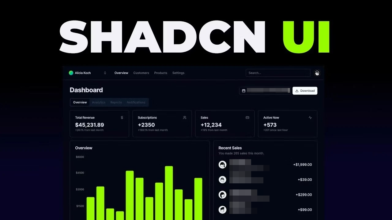
Shadcn/UI is a customizable component library built for React.js. Unlike larger frameworks like Material UI or Bootstrap, Shadcn/UI grants more control over the look and feel of your components. It provides core building blocks, allowing you to create a unique interface without being confined to predefined themes.
Why Choose Shadcn/UI?
- Lightweight: Unlike bulky libraries that bundle numerous unused components, Shadcn/UI offers only what you need.
- Customizable: Tailor the components to meet your project’s unique requirements.
- Optimized for React.js: Seamless integration lets you focus on coding rather than configurations.
- API Ready: Compatible with tools like EchoAPI, simplifying the management and testing of API endpoints within your React app.
Integrating Shadcn/UI in Your React.js Project
Now that you know what Shadcn/UI is, let’s walk through the process of integrating it into a React.js project. This guide assumes you have a basic understanding of React and that Node.js is installed on your machine.
Step 1: Create a New React.js Project
If you already have a React.js project, you can skip this step. Otherwise, create a new project using the following commands:
npx create-react-app my-shadcn-ui-app
cd my-shadcn-ui-app
npm start
This will create a new React.js project named my-shadcn-ui-app and start the development server. You should now see the default React app running.
Step 2: Install Shadcn/UI
To add the necessary dependencies manually, follow the steps below:
- Add Tailwind CSS: Shadcn/UI components are styled using Tailwind CSS. Follow the Tailwind CSS installation guide to get started.
- Add Dependencies:
npm install tailwindcss-animate class-variance-authority clsx tailwind-merge
- Add Icon Library:
- For default style:
npm install lucide-react - For New York style:
npm install @radix-ui/react-icons
- For default style:
- Configure Path Aliases:
Intsconfig.json, configure path aliases as preferred. Here’s an example using the@alias:
{
  "compilerOptions": {
    "baseUrl": ".",
    "paths": {
      "@/*": ["./*"]
    }
  }
}
You can now start adding components to your project.
Step 3: Import and Use Shadcn/UI Components
Let’s add some Shadcn/UI components to your React.js app. In your src/App.js file, import and use a component like the Button:
import React from 'react';
import { Button } from 'shadcn-ui';

function App() {
  return (
    <div className="App">
      <header className="App-header">
        <h1>Welcome to My Shadcn/UI App</h1>
        <Button variant="primary">Click Me!</Button>
      </header>
    </div>
  );
}

export default App;
The Button component is imported and used in the App component. Customize it with various props—in this case, variant="primary" for primary styling.
Step 4: Customize the Shadcn/UI Theme
One of the best features of Shadcn/UI is its customizability. You can tweak the components to match your app’s design language.
a) Create a Custom Theme File
Create a theme.js file in your src directory:
const theme = {
  colors: {
    primary: '#ff6347', // Tomato color
    secondary: '#4caf50', // Green color
  },
  fonts: {
    body: 'Arial, sans-serif',
    heading: 'Georgia, serif',
  },
};

export default theme;
b) Apply the Theme to Your Components
Apply your theme using the ThemeProvider component. Update your src/App.js as follows:
import React from 'react';
import { Button, ThemeProvider } from 'shadcn-ui';
import theme from './theme';

function App() {
  return (
    <ThemeProvider theme={theme}>
      <div className="App">
        <header className="App-header">
          <h1>Welcome to My Shadcn/UI App</h1>
          <Button variant="primary">Click Me!</Button>
        </header>
      </div>
    </ThemeProvider>
  );
}

export default App;
In this updated code, ThemeProvider wraps your app, with the custom theme passed as a prop.
Step 5: Managing APIs with EchoAPI in Your Shadcn/UI + React Project
Your front-end looks great; now it's time to make it functional by connecting it to an API. This is where EchoAPI shines. EchoAPI is a robust API management tool that simplifies API testing, documentation, and developer collaboration.
Why Use EchoAPI with Your React.js App?
- Easy API Testing: Test endpoints within your React project.
- Seamless Collaboration: Generate and share API documentation.
- Speed Up Development: Mock API responses easily.
Using EchoAPI for API Calls
Let's say you’re building a React.js app that fetches data from a pet API. Here’s how you use EchoAPI to manage the API calls:
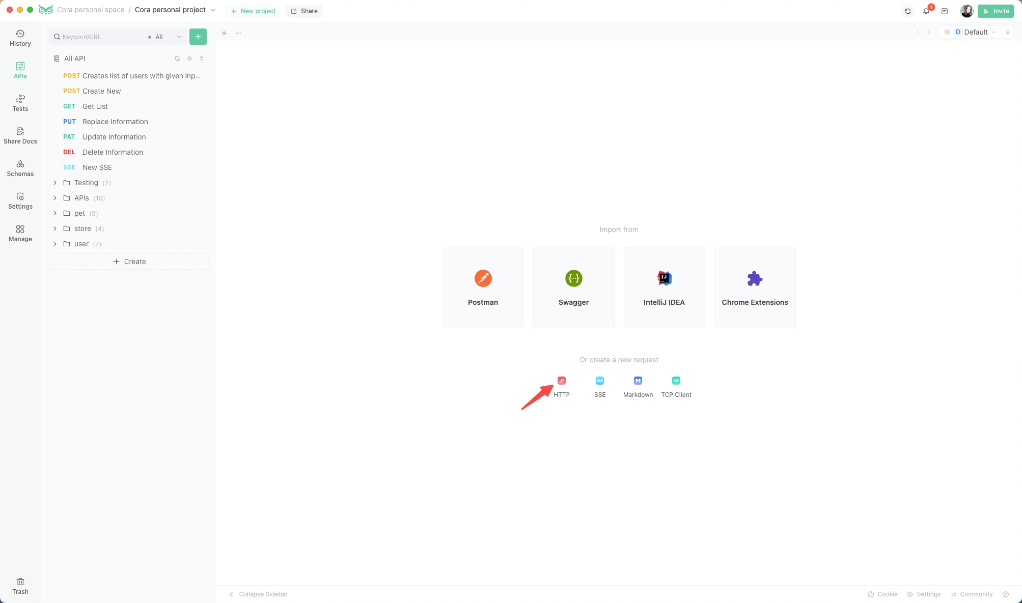
Open EchoAPI and Create a New Request:
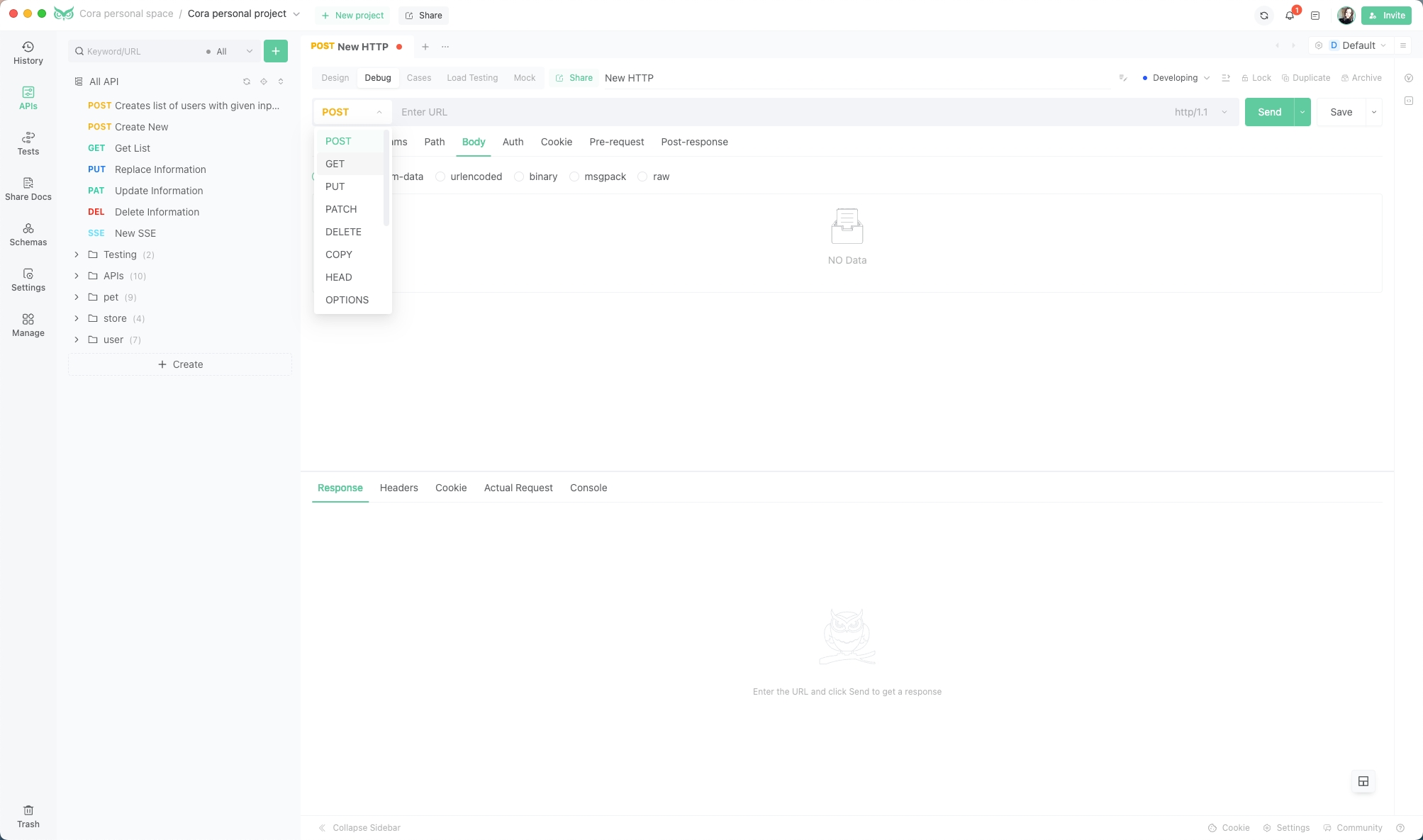
Configure the Request:
Enter the URL of your API endpoint, select the HTTP method, and add any necessary headers, parameters, or body data.
Send the Request and View Results:
Click the "Send" button to see your test results, including status code, response time, and response body.
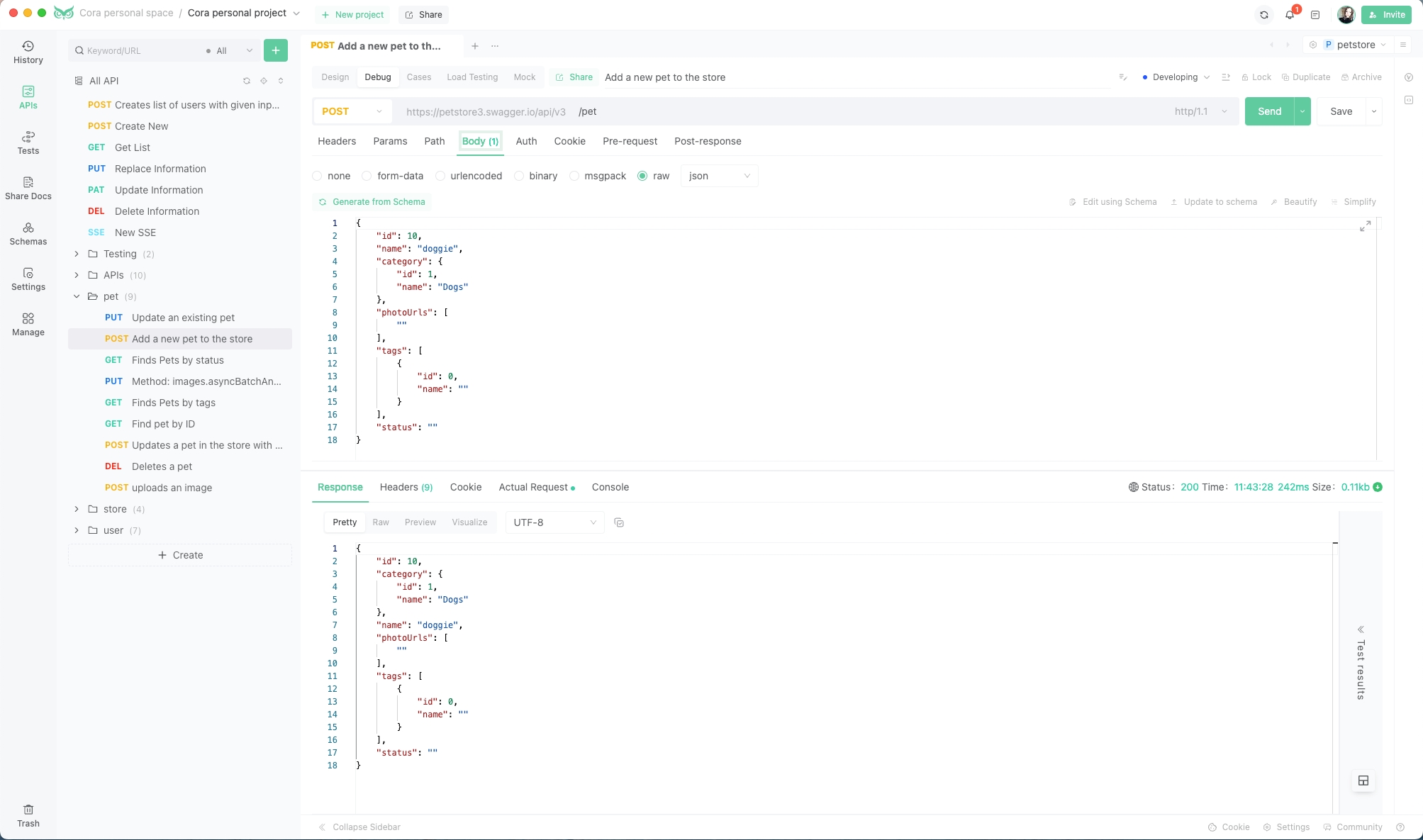
EchoAPI is invaluable for testing APIs, ensuring the quality, reliability, and performance of your web services. It simplifies the process by eliminating the need to write additional code or install software—just use your browser and enjoy EchoAPI’s user-friendly features.
Step 6: Best Practices for Using Shadcn/UI and EchoAPI in React.js
Here are some best practices to optimize your use of Shadcn/UI and EchoAPI:
- Optimize Performance: Use only necessary Shadcn/UI components to keep your bundle size minimal.
- Modularize Components: Break down your UI into small, reusable components.
- Test Your APIs: Use EchoAPI to thoroughly test API endpoints and ensure functionality.
- Use Version Control: Regularly commit changes to avoid losing progress and facilitate team collaboration.
Conclusion: Building React.js Apps with Shadcn/UI and EchoAPI
Congratulations! You now have the knowledge to use Shadcn/UI in your React.js projects, from setting up the library to customizing components. Also, with EchoAPI, managing your API calls is a breeze.
Whether you’re building an internal tool or a customer-facing application, Shadcn/UI offers the flexibility to create something unique, while EchoAPI streamlines your API workflow. Happy coding!


 EchoAPI for VS Code

 EchoAPI for IntelliJ IDEA

 EchoAPl-Interceptor

 EchoAPl CLI
 EchoAPI Client
 API Design
 API Debug
 API Documentation
 Mock Server


